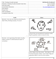
 I use a template to write multimedia scripts. It divides the visual and audio sections into separate columns. I noticed that many writers start on the narration portion, and then go back and add the descriptions of the visual side. Since I think visually, I usually start with what I want the audience to see, and then fill in what what needs to be said about each visual. In a “Show and Tell” video they start with the “Tell.” I like to start with the “Show.” Also, I insist that each visual be an instructional hook to hang a concept on. Each graphic has to communicate something.
When it’s time to present textual information, a lot of presenters get stuck in a rut. They can’t get
past list making. By thinking visually, you can help the audience remember the concepts and avoid “death by bullet point.” For example, if you’re presenting five related concepts, you can place the concept names around a five-pointed star. That’s far more memorable than a list of bullet points. One step further, find a visual way of representing each of the concepts, and place icons around the star.
You've got nine items? Try organizing them in a tic-tac-toe grid. You'll help your audience visually organize the content to make it easier to remember.
Writers are proud of their way with words. Thinking visually, they can magnify that talent.


No comments:
Post a Comment